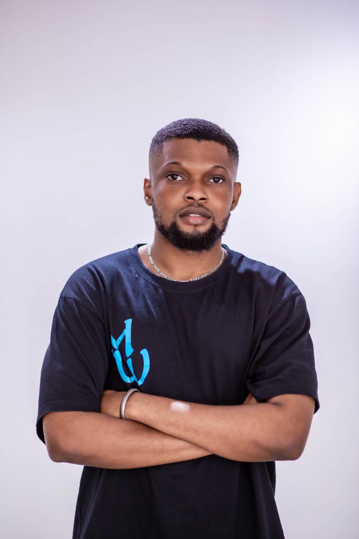
The spotlight falls on an often unsung hero – the multidisciplinary artist, Bidemi Tata, whose creativity threads a visual narrative that intimately accompanies Psycho YP's musical odyssey.
In music, success is rarely a solitary journey. Behind every great artist stands a dedicated team, tirelessly working to shape their career, support their vision, and amplify their talents. Psycho YP, who has been dubbed The Fresh Prince of Nigerian Rap since his inception with "Lost in The Sauce" EP is no exception. With his outstanding catalogue, Psycho YP owes a substantial part of his success to the collective efforts of his team Apex Village. Together, they have created an unstoppable force that has propelled Psycho YP to the forefront of the Hip Hop scene in the music industry.
Beyond the music itself, Apex Village has been integral in crafting YP's image and ensuring its message reaches the masses effectively. In the age of social media and digital marketing, branding plays a pivotal role in establishing an artist's message, shaping public perception, and driving engagement.
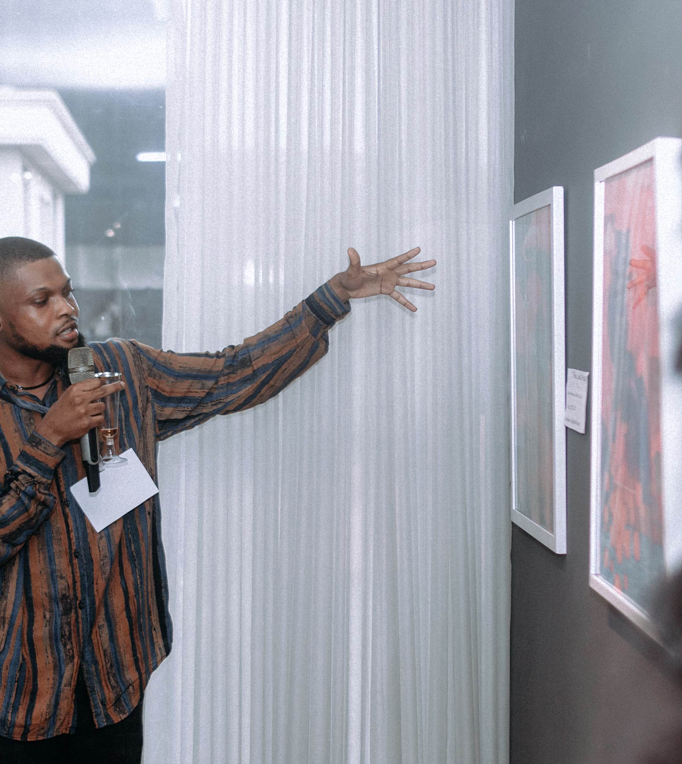
From music videos to photo shoots, lifestyle and branding. There has been a creative trail of Psycho YP’s evolution documented in the form of art designs.
The art direction for Psycho YP has been handled by Bidemi Tata, a multidisciplinary artist skilled in illustration, graphic design, art direction, and more.
Born in Lagos, Bidemi is a self-taught artist who has spent the past six years working with Artists (Lady Donli, Psycho YP), Companies (Empawa Africa, YBNL, UMG), Nigeria breweries and the list goes on.
“As a self-taught artist, one of his biggest goals is to positively influence the expectations of a Nigerian digital artist and create a standard of creativity that allows digital art to be respected as a serious form of expression in the Nigerian creative community.”
His distinct personal creative style emanates resplendence, longing for self-expression, and an escape from reality through his works. He documents the human experience using his own personal encounters and observations as windows into his creative expression.
How did you get your start as a creative?
I have always been interested in digital art since I discovered it in 2016, and I felt compelled to try to create digital illustrations right after; I practised and experimented with my phone a lot. My first real chance to show my skills professionally was when Lady Donli reached out to me to work on some illustrations for her single “ice cream” and her official logo. It was a big deal for me at the time and I will always appreciate her trust in me because, I wasn’t getting much of that back then. She was the first to really give me a chance.
You and Psycho YP have a long working history together. How did the two of you initially connect?
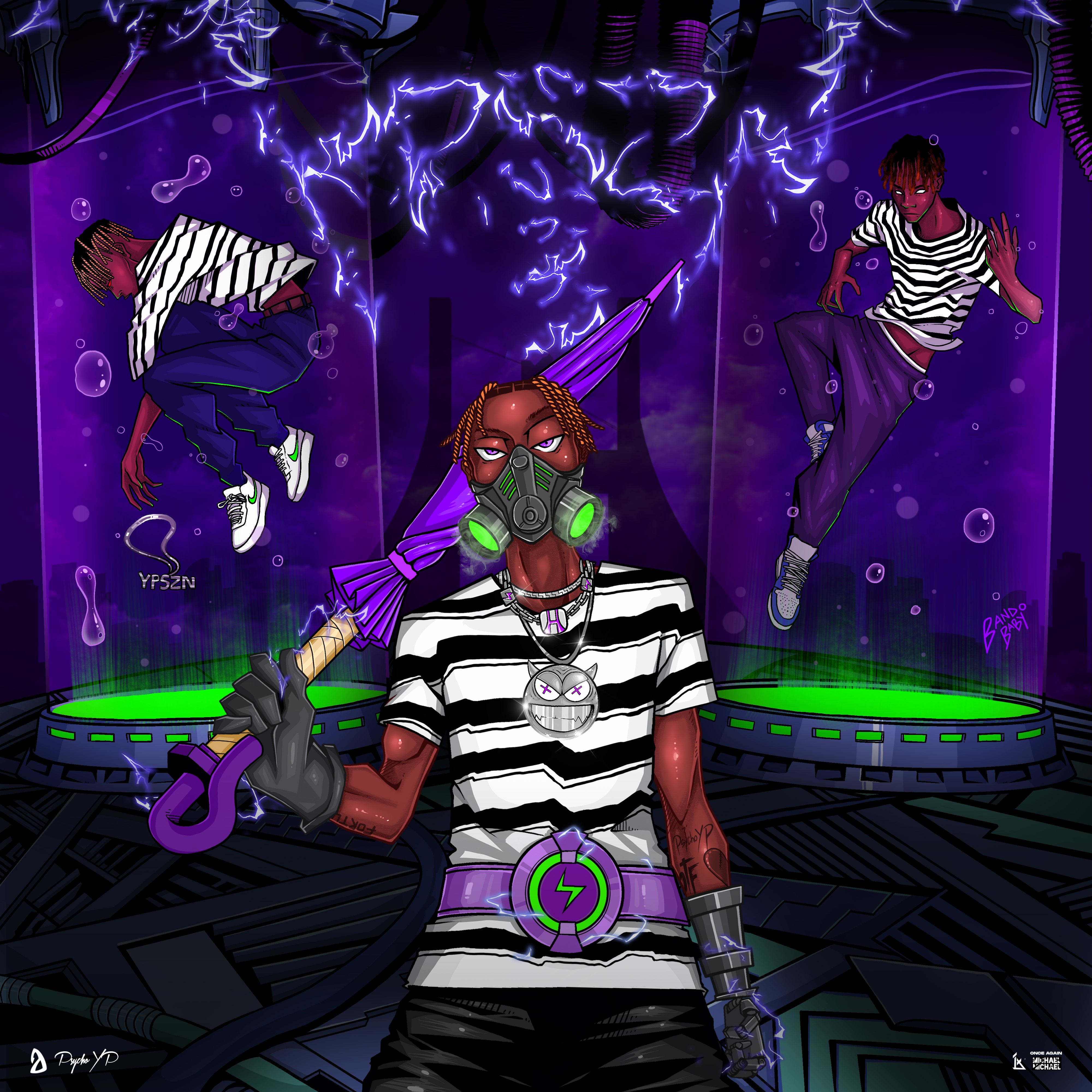
Yes, we have been working together for 6 years now. YP hit me up on Twitter in 2017 to create art for his song “Who Dis”. He sent me a snippet along with a picture which was pretty seamless. He really respected what I could do and showed that he really valued the relationship between art and music. Right after we completed that we started working on the cover for his debut tape YPSZN. That was where I came up with the striped shirt and the purple umbrella insignia that has become an icon associated with his brand ever since. We both respect our crafts and each other. The chemistry in our working relationship is very evident in the good work of art we create constantly.
How has your working relationship with Psycho YP evolved over the years?
We’ve become friends over the years. The loyalty, trust and respect we’ve shown each other testifies to that. I can say it is much easier to create for him now, because, I know what he wants and he knows what I can bring; We both really enjoy art and have similar ideas of how art should look and feel when associated with music especially. Our working relationship has grown from a straightforward pay-for-hire situation to now directing visual campaigns with months of planning, researching, experimenting, merch work etc. he has been a part of my growth as an artist, we constantly create iconic bodies of work and is something I completely love being a part of.
YP sends me songs years before he even considers dropping them, so I usually have the ideas already before he’s ready to release the music.
Break down the creative process for each project, how you achieved each direction and inspiration?
For YPSZN1 it was a collaboration with fallofmichael and we needed to communicate YP’s entrance into the rap scene, the coming of a new season/a new age in Nigerian hip hop and I made a few illustrations with the idea of YP holding an umbrella indicating the SZN is here with him and he’s the only one prepared for the rain; The only one that can step outside.
YPSZN2 was pretty straightforward because we were tasked with creating something new, but maintaining the themes and also displaying our growth. So we opted to make the storm level up into a super typhoon/hurricane, a bigger storm that has blown away the umbrella this time. It symbolizes YP's evolution, the effects of SZN1 and YP’s resolve to withstand anything.
EUPHORIA was enjoyable, because, it was a deviation from the YPSZN line up. The art direction had to be different. It was a personal perspective for YP, a state of mind for me too at the time. We had done something we had always wanted since we were kids and that was to make a career with our different talents and could feel nothing but joy, confidence and gratitude that came with our accomplishments then. That was the idea behind the themes of gleefulness, elation, boldness and bursts of ecstasy that inspired the work of art.
YPSZN3 was the final lap of the YPSZN trilogy the outcome of the story we’d be building for 5 years. it had to be intentional and decisive, but, also leave a cliffhanger for more to come. The umbrella is closed this time, signifying the end of the storm, leaving behind a desolate-dystopian world and YP, the only survivor.
Also paying homage to the different phases of YP from the prequels that played their part in bringing about ultimate-form YP; signifying the end of the trilogy and a potential for more.
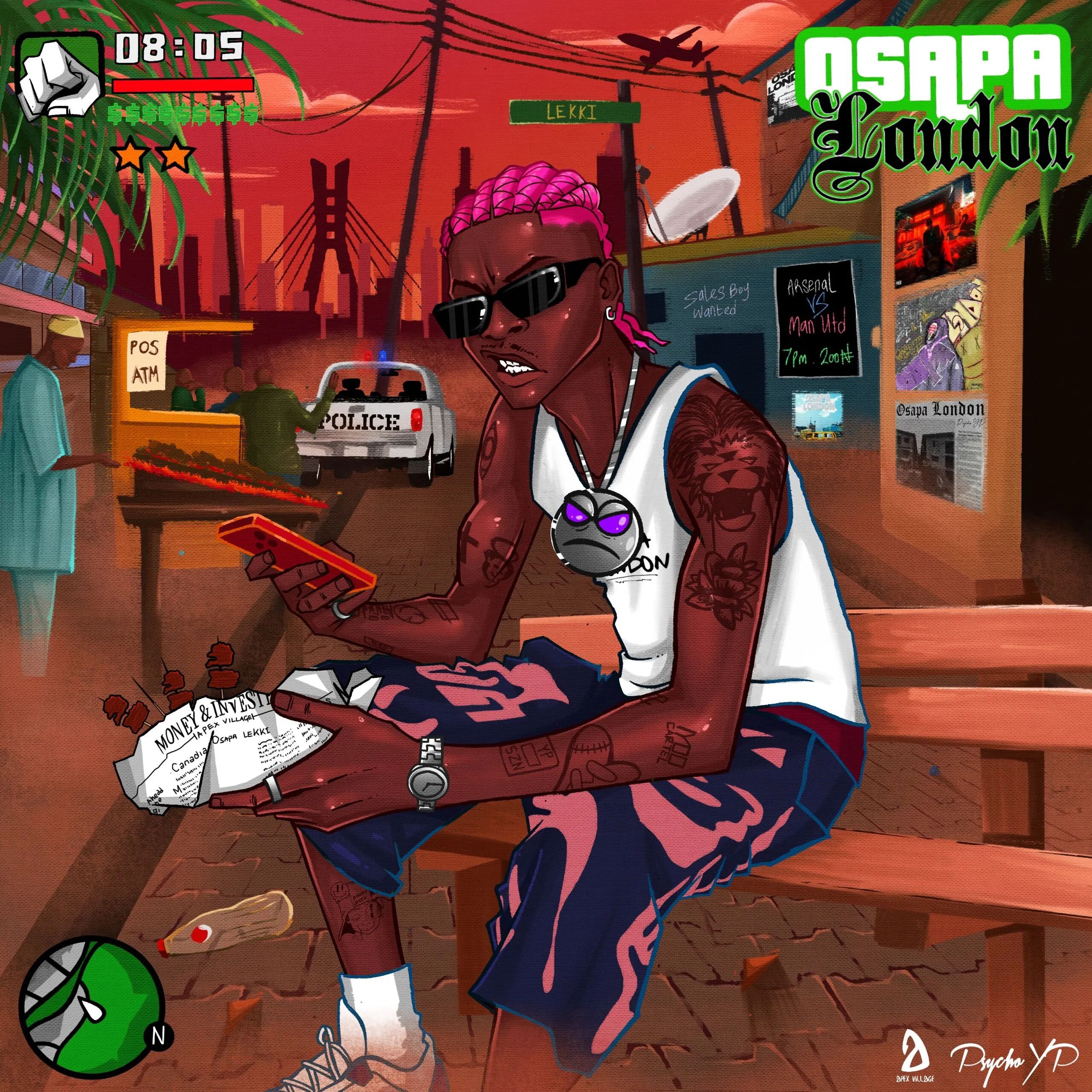
In OSAPA LONDON, YP is on an adventure in Lagos, faced with the trials of being a rapper in Lagos: the rush, the bliss, the bustles of the city, the hurdles and the rough edges. Despite that, he is prepared to take it on; his journey from szn1 till now has prepared him. These were the themes I had to communicate through the artwork. I referenced the video game GTA: San Andreas for this, because it made sense, Lagos always felt like a game of life that had to be beaten to succeed and YP just joined the campaign. Also the iconic white vest, San Andreas fans will get this reference. I had a lot of fun with this one, and I’m glad people loved it.
Can you share any behind-the-scenes anecdotes or interesting stories related to the creation of the album cover? Any unexpected surprises or memorable moments?
Some of the Osapa London posters that feature on the walls of the artwork are real designs made by some really amazing artists. Those were my favorite details on the artwork and it made it perfect.
Which project cover challenged you the most creatively? How did you push the boundaries and what did you learn from that experience?
The biggest challenge would be YPSZN1. I made that illustration with my phone, It was Very tough.
Creatively challenging, Euphoria. I had to really tap into a lot of emotions and perspectives to pull it off, experimented with 3D too. A lot of details had to be readjusted and created; we wanted to make perfection and we almost did. I learnt a lot about patience, attention to detail and how far I could stretch my potential as a visual artist. It was really fun as well, especially as YP let me be myself, create without inhibitions and just focused on expressing myself.
How do you adapt to the gritty mindset of Psycho YP 3 versus a homage piece like Osapa London?
YPSZN was a fictional tale to me, about an iconic character that YP embodied. So there was some permission to go overboard and be loose with the direction. For OSAPA LONDON, I had to be grounded with it and be faithful to the reality of being a young ambitious man experiencing Lagos. The dust, the almost sepia lens Lagos is viewed through, the viewing centers, the police SUVs we see everywhere, suya etc. I had to make it as raw as I could, so I rendered it with a canvas and used some brushes I’d never used before.
All of Psycho YP’s covers, including Osapa London, include Easter eggs. Could you share some examples and explain their significance? How do you balance dropping hints while not giving too much away?
For YPSZN1, YP is presented with a long-sleeved striped shirt indicating he’s got a lot up his sleeve and we are about to find out.
In YPSZN2, this time I took off one sleeve. This indicates that we now know what he has up one sleeve but are still curious to know what he has under the other.
In Euphoria, There is a skull with blue flames on the cover, YP is a big fan of Dave’s Psychodrama and I paid homage to that. There were three variations of YP on the body as well, a subtle nod that a third YPSZN is on the way. That led to YPSZN3 where the three variations return and this time all the sleeves are out indicating we now know what YP can do and expecting more. He has conquered Abuja and now his eyes are set on Lagos, Osapa London.
These details had to be very subtle not to give off anything too much, but the pattern is evident when you look at it all chronologically.
What would you tell all the kids that are designing in their bedrooms right now?
 Allow yourself to be inspired and aim to inspire. Never stop creating, protect that child in your mind. It’s key to maintain that childlike curiosity and bravery. Creating without fear of criticism, just the euphoria to make wonderful things, it’s very essential. Art gives you the freedom and power to make anything, take advantage and choose to create wonder. There is strength in intention.